
If you’ve read some of my previous posts you’ll know that I love designing interfaces, and that this is very much a direction I want to go in more with my work. Aside from interfaces, I also love Star Trek.
In fact, I think Star Trek is one of the things that first got me interested in this. When I was younger the various computer displays in the show fascinated me, and I remember spending a lot of time trying to recreate them in MS Paint. Cut to 2016, I’m working as a motion designer with a passion for interfaces and Star Trek turns 50 years old. What better way to contribute my own little homage to one of the things that inspired me than to do a study of some of the displays the show has seen over the years?
Each of these interfaces took on average about a day to design and animate. In this post I will briefly go over each of them, the challenges they presented and the techniques I used to overcome these. Additionally, if any fans reading this are interested in creating some displays of your own, or if you just see a colour you really like, I’ll share the ones I used.
Before I start, I’d also like to say that I’m not the first to do this. There’s an amazing website out there, lcars.org.uk, that has animated examples of many of the interfaces seen in the show, many of which I used as references for these designs.With that said, here follows the breakdown.
1960s
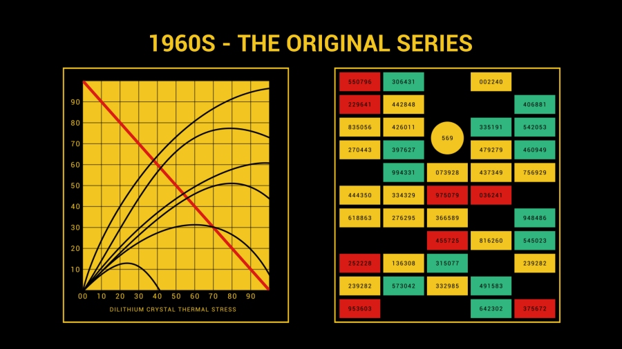
As seen in: The Original Series (1966-1969), The Animated Series (1973-1975)
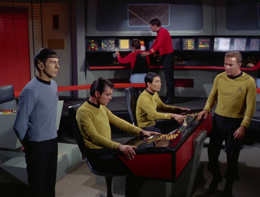
The first thing I thought when studying this design was ‘its so 60s!’. Something about the colour scheme just reminds me of that decade. Arguably the simplest of the designs/animations, the panels on the TOS bridge are divided into square windows, with each showing an individual display. Some of these displays show various technical displays, but most of them (I’m assuming because of budget reasons) are just a set of blinking coloured lights.
I chose to make two of these windows, one with the blinking lights and one with a graph and some technobabble. I’m pretty sure the graphs in the show were still images, but to make mine a little more interesting to the eye I chose to animate it.
The blinking lights were actually more time consuming to make than the graph, with me having to position and label all the individuals boxes. For the labels, random.org came in very handy to generate the numbers on each box, but that’s not where it stopped being useful.
I adopted a literal paint by numbers technique for the colours, something I’ve never tried before. To colour all the boxes and to decide which ones appear/disappear/change colour I asked random.org to generate a grid of numbers for me with the same amount of numbers horizontal and vertical as there were boxes. Then I told it to fill the grid with numbers from 0 to 3, with each number representing a colour and 0 being ‘off’. Using this grid, I just filled each box with the corresponding ‘number’ and voila, a random animated display. Here’s an example of such a grid:
0	3	1	1	3
0	3	0	0	1
3	3	2	0	3
2	2	2	1	3
2	3	2	0	2
0	3	0	0	2
0	1	2	0	0
3	2	2	3	1
3	3	1	0	0
1	2	2	0	1
2	0	2	2	1
I’m quite pleased with the result, and I’m definitely going to be using this ‘paint by numbers’ technique again the next time I have to design a large amount of objects using a common theme.
Speaking of colours, these are the ones I used in this display, based on a screenshot I lifted from lcars.org:
Red: D81B14
Green: 31B67E
Yellow: F2C520
1970s – 1980s
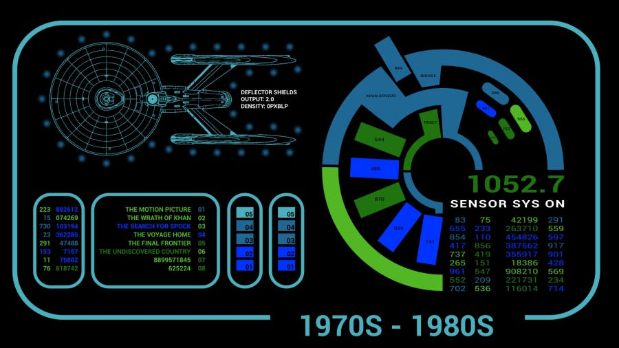
As seen in: The Motion Picture (1979), The Wrath of Khan 1982), The Search for Spock (1984), The Voyage Home (1986), The Final Frontier (1989), The Undiscovered Country (1991)
Originally I wanted to do an interface for each decade, but then there wasn’t a lot of Star Trek in the 70s. Instead I opted to go for when the design was first conceived and/or used the most. This is the interface style as it was seen in the films with the original series crew. At first glance you can immediately tell that the designers had more time/money to work with as these displays are a lot more intricate. The designs didn’t deviate too much over the course of the films, and more or less retaining the same colour palette.

For this screen I used a display from The Wrath of Khan and The Final Frontier (top left and right) and took some creative license creating a general sort of systems readout for the bottom left.
Once again the display I thought would be the hardest, the Wrath of Khan one, ended up being the easiest. The only difficulty was in ensuring that all the little dots for the shields were equally placed around the ship. However, there’s a nifty little tool online that I have used on several projects in the past that calculates the coordinates of objects in a circle. Simply paste those into your position value in AE and you’ve got perfect circular distribution in your design.
My own little design was also quite easy to make, using the same pain by numbers technique that I used for the 60s diplay to colour it in. The tricky part was that big circle thing. Now the easy way would have been to draw the various elements in Photoshop or Illustrator and import them, but then as an added challenge I wanted to do as much as possible inside of After Effects. So to create the shapes of that circle I used masks. Lots of masks.
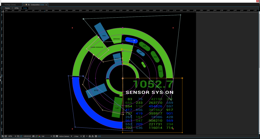
Unnecessary, but good practice in creating abstract shapes inside of AE. Once I’d drawn all the shapes it was just a question of random.org generating the numbers, colours and animation for me. To be honest, the RNG probably did most of the work on this project. However, as it only generates grids, figuring out how to convert the data it gave me into a circle corresponding to the circular shape I had gave me quite a headache. In the end I assigned each column of the grid to a separate element (i.e. the rings and the different types of buttons). A different technique would have lead to a different distribution of colours, but on the whole the animation wouldn’t have been too different.
Colours used:
Light Green: 51B723
Dark Green: 1F740F
Light Blue: 1F6895
Dark Blue: 0033FF
Cyan: 4AB0BE
1980s – 1990s
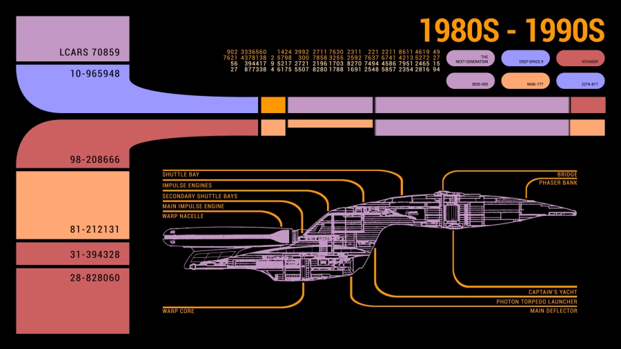
As seen in: The Next Generation (1987-1994), Deep Space Nine (1993 – 1999), Voyager (1995 – 2001), Generations (1994), First Contact (1996), Insurrection (1998), Nemesis (2002)
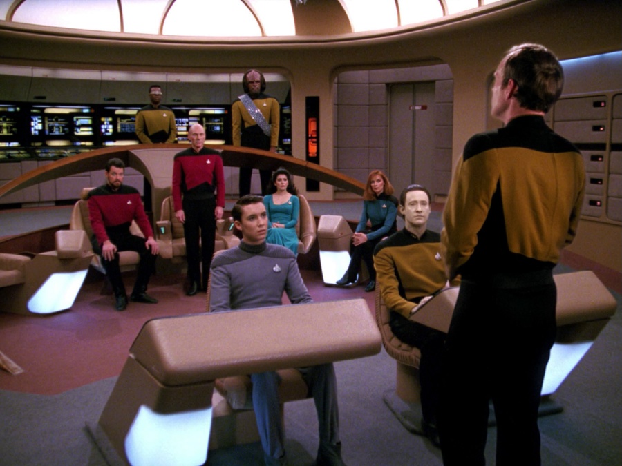
Probably the most widely known/recognized of all the Star Trek interfaces, this one (called LCARS in universe, short for Library Computer Access and Retrieval System) was designed by Michael Okuda. All TNG era Star Trek computers were entirely touchscreen based with this design style, in a sense predicting the prevalence of touchscreen devices that we see today.
This is the design I mentioned in the introduction that inspired me to look into interface design, and recreating it was an absolute nostalgia trip. When first studying all the various designs while planning this project, I was sure this one would take the longest to make. Surprisingly, it was the easiest.
Given how widely used this style was in the 80s and 90s, there were a lot of examples to chose from. I ended up going with the most common display, the first one you see when you type ‘LCARS’ into google image search.
The only real challenge I faced was the swept shapes in the top left quadrant of the screen, which, as with the previous decade’s design, I managed to draw inside of AE using masks.
The numbers at the top had me a bit worried, even with the help of an RNG they threatened to be a lot of work. However, upon closer inspection of some examples, the numbers don’t change colour, or even change their values. They just light up/appear/disappear in rows. As such I was able to save a lot of time by applying track mattes to the grid I’d generated rather than having to animate each number individually.
Lastly, there was the ‘window’ formed by the lower half of the design. These were everywhere in the various series/films and had all kinds of information in them, from maps to medical information. However, as TNG was the first to use these, and given the ridiculous amount of schematics and technical data available for the Enterprise D, I went with a simpel little engineering display of this ship as a small tribute to all the work that went into coming up with all that lore.
Colours used:
Red: CC6061
Blue: 9B98FE
Yellow: FE9800
Beige: FFA873
Purple: C498C4
2000s
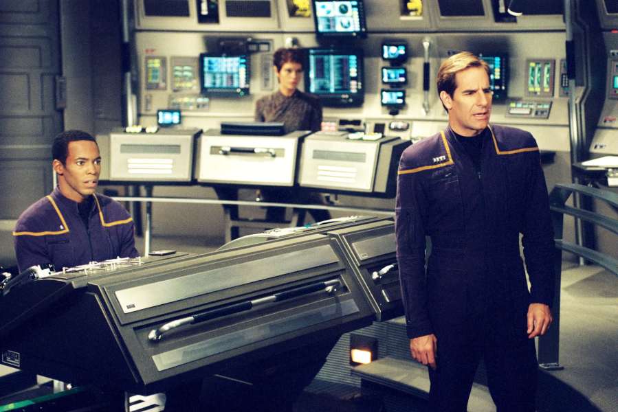
As seen in: Enterprise (2001 – 2005)
Most people like to pretend Enteprise never happened, but that’s a topic for a different discussion. Personally I quite enjoyed the show and think its rather underrated. Whichever way you look at it, it’s still Star Trek and was all we had in the 2000s, so for this era I recreated one of the displays from the show.
This one was one of the simplest ones to make, but I still found it very interesting from a design point of view. It is clear that the designers wanted to go back to the style of the original series, as the show is set as a prequel, taking a step away from the curves and swept lines of the 80s and 90s and going for a simpler, boxier approach. However, you can also tell they had a bigger budget and modern design techniques at their disposal, with the interfaces being a lot more intricate and detailed than their 1960s counterparts.
The only real challenge here was in creating the border for the main window. At first glance it looks like a simple rectangular outline, but upon closer inspection you can see that there’s a few bits sticking out like the buttons in the lower left quadrant and the little circle at the top left corner. I quickly solved this by fiddling with the layer order and some masks, and aside from that it was plain sailing with the help of random.org, my best friend at this point.
Colours used:
Dark Grey: 1D1F1F
Mid Grey: 928F9B
Ligh Grey: C2C6CC
Red: FF0000
Blue: 289CFF
Yellow: FFE139
2010s
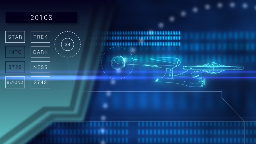
As seen in: Star Trek (2009), Star Trek Into Darkness (2013), Star Trek Beyond (2016)
The most recent interface, used in the reboot series of films that have been coming out for the past years. This one has nothing in common with any of its predecessors, and I assume this has to do with the ‘clean slate’ principle the filmmakers went for with the alternate timeline these films are set in. As such, recreating this one was… different.
Where do I begin? The first challenge I encountered was the fact that there is little to no reference imagery available for this one. After hours of searching I managed to find a collage of stills from the films that someone was kind enough to make, which gave me some idea of the general look and feel of the design. Despite this, I had to take a lot of creative license, especially with the animation, as there was next to no reference footage of this.
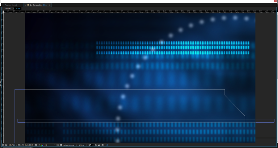
The first thing that sets this interface apart from the rest is that up until now the Star Trek displays had always been on a solid black field. Not anymore, now its all moving blue gradients. To create this, I first made a blue gradient background. I then added a library image of tech (pipes, wires etc) and blurred/blended it until it was hardly recognizable. Animate it to slowly move and duplicate it a few times for depth and you’ve got yourself a modern futuristic backdrop. I also added a couple of ‘objects’ floating about, various lines and things that seem to be quite common in modern day design, and that was the background finishes.
Then I added a schematic of the ship (again surprisingly hard to find), as that’s something that’s been in all the displays save the 60’s one. I also included some rotating rings (so many expressions!) as a kind of indicator and that would have been one of the basic displays seen in the reboot films done.
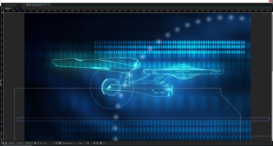
But, I didn’t stop there. My reference image showed another display with a very cool looking window in it, which I really wanted to have a go at recreating. Therefore I decided to include this in the display as well, coming in half way through. Again I made a gradient as the backdrop, cut out the shape using masks and then duplicated it to give it more depth with a kind of ‘tab’ look. I then added some display elements to it including another animated ring with a changing number inside it. Now, because these films are a reboot of the original series, I felt I had to call back to the 60s design somehow. The answer: boxes! These boxes were actually in the reference image I used, but I chose to animate them the same way I did the 60s ones, only instead of being solid they were outlines and instead of changing colour they change in brightness.
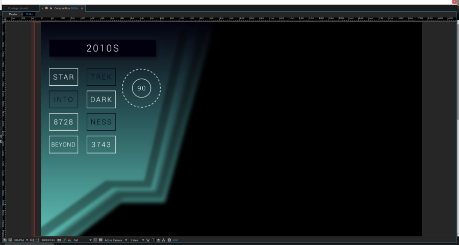
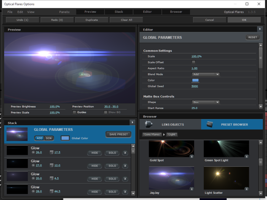
Lastly, the pièce de résistance. One thing the J J Abrams reboot films are particularly infamous for is lens flares, so there was no way I could make a tribute to them without adding at least one. As an inside joke, one of the presets in the Optical Flares plugin is called the Jay Jay and looks very similar to the ones seen in the films. Of course I used this one, but modified it to make it a little more subtle (or at least as subtle as a giant lens flare can be).
While this display was the most complicated and time consuming to make, I also had the most fun with it and it gave me some much needed practice with modern interface design.
Colours Used:
Dark Blue: 02000E
Light Blue: 144F91
Cyan: 5Ec4B9
This project was not without its challenges, but I thoroughly enjoyed doing it and am very please with how it turned out. It was really good practice and I developed some new techniques that I’ll definitely be using on future projects.
There’s a new Star Trek series set to come out next year, and I’m very curious to see what kind of displays they design for it. All we know at the time of writing is that it will be some kind of prequel. Will the displays be a continuation of the ultra modern style of the reboots? Or a callback amalgamation of the Enterprise and TOS screens? I can’t wait to see what they come up with.
